

Deep Dive into The Sublime Spectrum
A deep dive into my ongoing series of original artworks, looking at my inspirations and fascination with minimal graphic form, as well as the joys of repetition and revisiting old projects and ideas.

A few years ago I started a new personal series, playing with concentric hand-cut layers of paper and sweeping gradients of colour. This was a chance for me to delve into the mass of paper stock that I’d hoarded over my fifteen years as a full-time paper artist, spilling out of every shelf and draw in my Brighton studio.
I titled the series The Sublime Spectrum, as a celebration of all of life’s wonderful spectrums – which I feel need to be cherished now more than ever! It also seemed to nicely sum up the gradient effect of the paper sheets, which I painstakingly piece together, often taking more time than the actually cutting out of the artworks.
But what started this series and why do I keep being drawn back to it? I thought I’d delve further into the project to try to answer those questions.
The initial seed of this series began with a poster I created for Outside Lands Festival back in 2017. Held at Golden Gate Park in San Francisco, the bill was amazingly varied – from Metallica and The Who, to Fleet Foxes and The Avett Brothers, as well as the likes of Lorde, Alt-J, Solange and A Tribe Called Quest.
I thought it would be fun to represent the diversity of the artists on the bill, through an array of typographic solutions, allowing me to play and experiment. I’d worked out that the type sat satisfyingly in a three column grid – a format I’d been playing with since my uni days, as explored in my previous article. So after persuading the promoters to go for this unusual poster format, I went onto craft a design with each letter having a different style and layering approach, but all brought together through a super limited palette, using a gradient of twelve warm tones.


Each paper cut piece was handcrafted out of sheets of coloured paper and then layered using foam board and white tack, which I find to be better than blu tack as it doesn’t leave residue on the paper – top paper artist tip!
The individual pieces were then shot in my studio using natural light, which I find helps to retain the paper textures – adding a tactile feel to these fairly graphic forms – as well as giving nice soft shadows. I then brought the final photos together for the poster design, allowing me to finesse the graphic grid, blurring the lines between the handmade and the digital, which a lot of my work often sits between.


I was delighted with how well the poster went down, winning a Communication Arts Award of Excellence and a Graphis Advertising Gold Award. I was also surprised to see the print making an appearance as a prop on HBO’s comedy series ‘Silicon Valley’ – described by a British friend as ‘the design equivalent of hearing your song playing in the cafe in Eastenders’ which I see as quite the compliment!
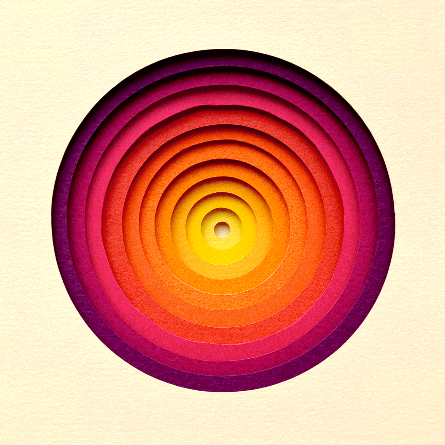
Out of all the typographic forms created for the poster, there was something I particularly enjoyed about the letter O form and its simplicity. It was the form that seemed to most successfully showcase the gradient of paper colours, through its crisp concentric circular forms, allowing the colours to really be the hero.
It also seemed to capture a sense of minimalism that I’d rarely been able to achieve in my work, which can often become quite busy and flourished – especially in the commercial realm, with clients often wanting to add extra details to an illustration, to further squeeze out any subtlety from the narrative.
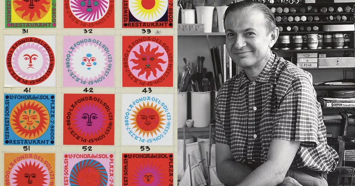
The simplicity of this paper cut piece reminded me of the work of one of my favourite designers Alexander Girard, who’s designs were often inspired by the folk art of Santa Fe, where he relocated in 1953 and lived until his death in 1993.
He trained as an architect, but went onto become a textile designer, working at Herman Miller with George Nelson (considered among many as a founder of American modernist design) and iconic chair designers Charles and Ray Eames. Together they are seen as having changed the face of design, with Girard’s designs favouring abstract forms and geometric patterns, exploring the realms of subtle colour and texture, as well as intensely vivid designs with super bright tones.
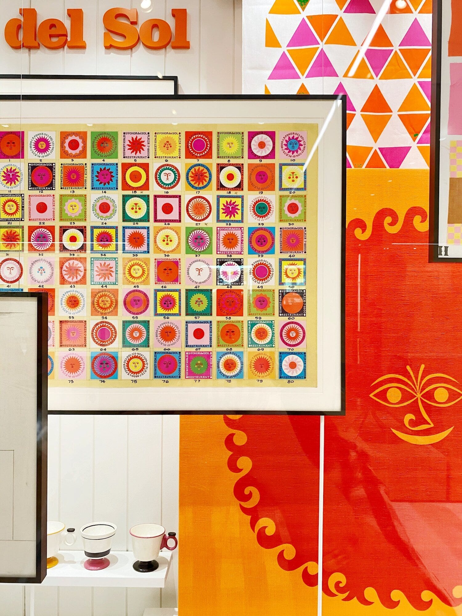
I especially love his series created for restaurant La Fonda del Sol in New York in 1960, creating over 80 sun motifs used throughout the restaurant on menus, matchbooks, carts, waitstaff jackets and more. This use of simple graphic form, but with a tactile approach, is something I really resonate with. I also love the use of repetition, through small changes, and it has made we realise that this is something I’d like to explore more in my own practice.
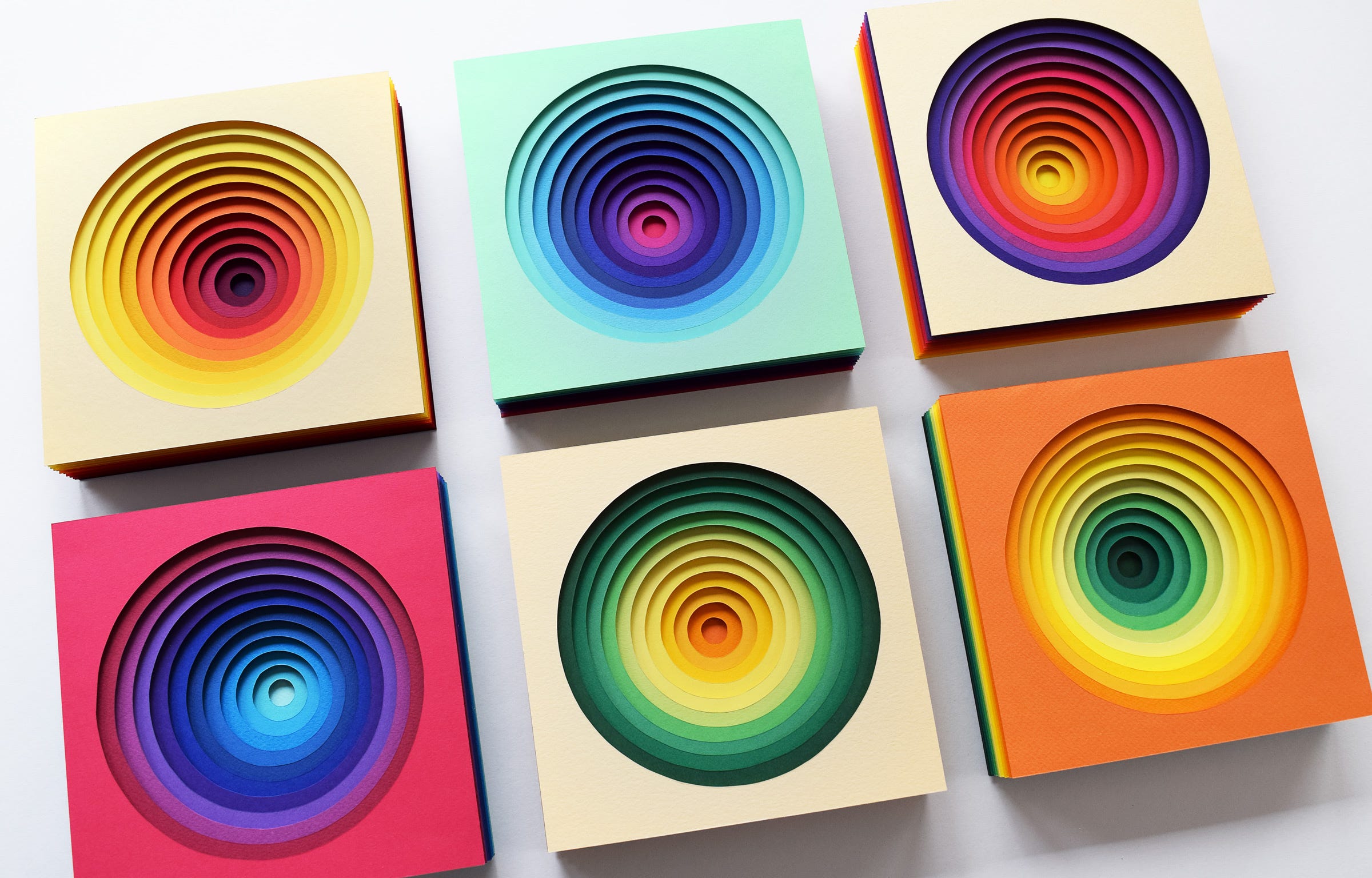
So applying Girard’s approach of repetition with small amends, I decided to revisit this initial multi-layered concentric concept and to expand the series – looking at different colourways, and forms, but all with the same 12 layered gradient approach.
There was something really fun and therapeutic about creating these artworks, both in the selection of the paper stocks, as well as the cutting process – allowing my mind to wonder whilst I hand-cut out all of the layers and then, as with the Outside Lands artwork, using strips of foam board to add a nice subtle depth between the layers.
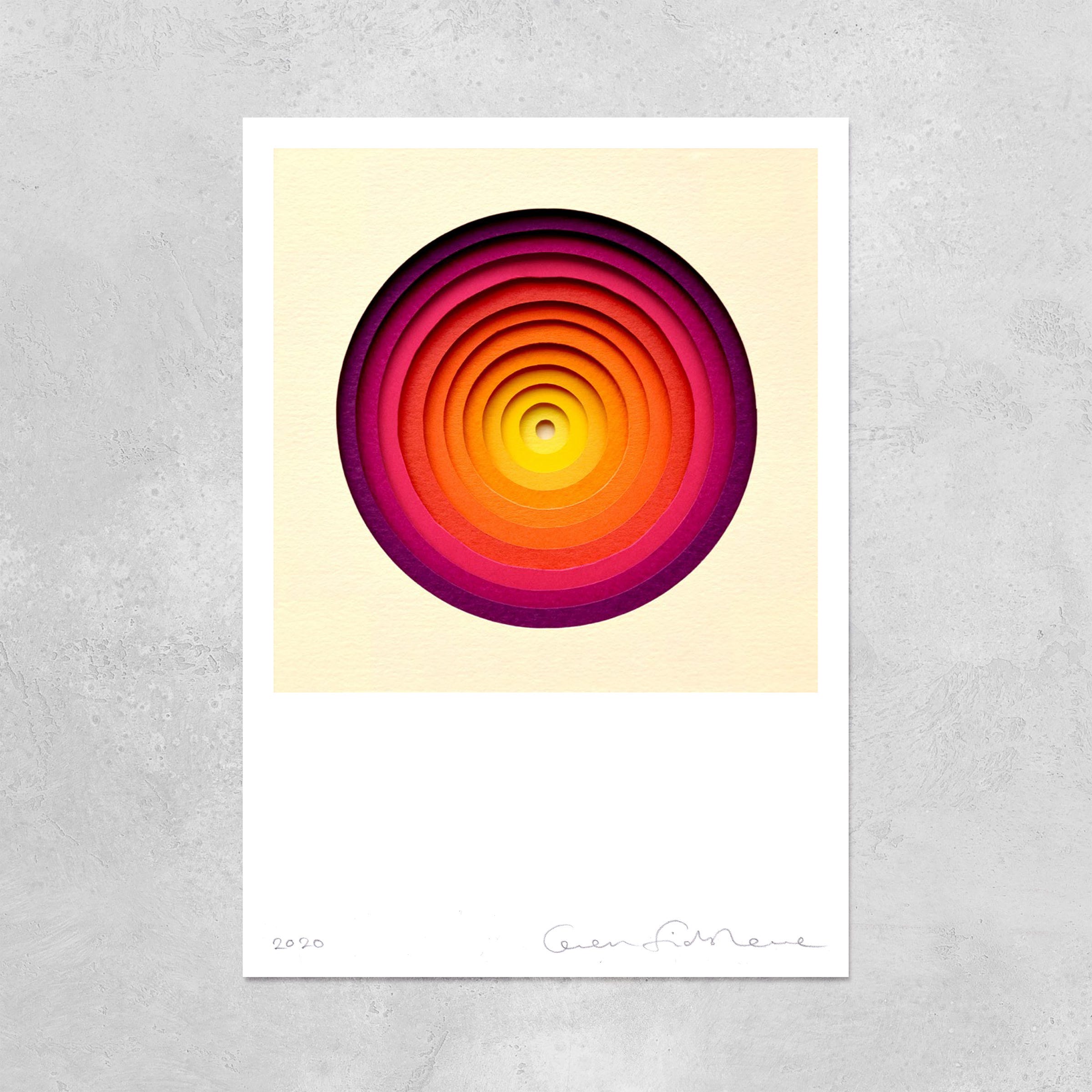
Almost exactly a year apart I created two different batches of six artworks, which are available to view in my online shop. I was really pleasantly surprised by the reaction, especially as these were a bit of a departure for me into new realms of minimalism.
After the artworks had swiftly sold out, I went to my natural place of “well, what’s next then?” As a designer / artist I often find myself jumping between projects and quickly moving onto the next idea or brief. I think that this has been heightened of late partly due to social media and how the algorithms often favour new things. It doesn’t leave a lot of space for the celebration of the old, or repetition of ideas. But this is something I’ve been keen to move away from, I just needed a helpful steer.
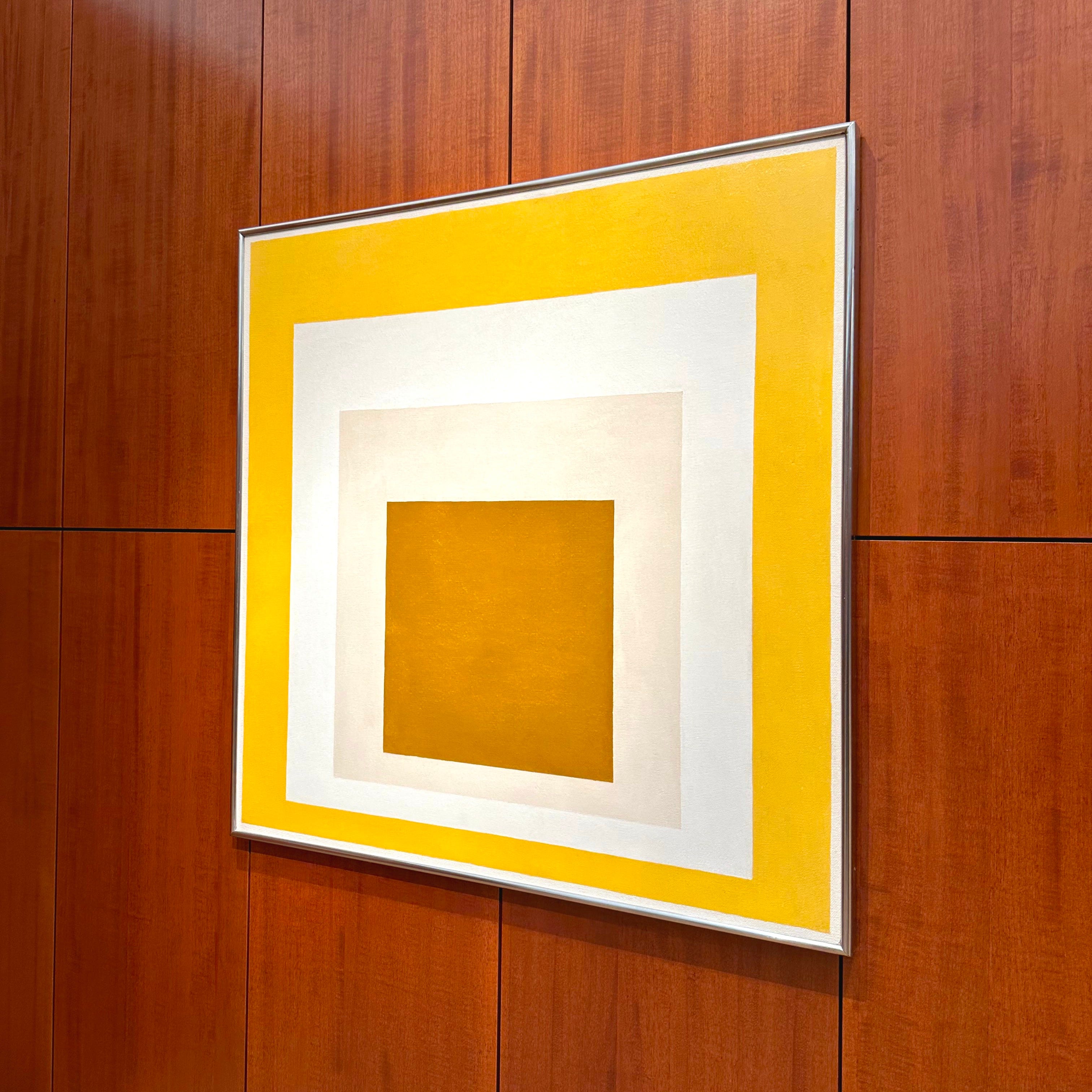
After doing some research I was reminded of the work of Josef Albers, who I had known from his studies of colour, but who’s Homage to the Square series I had never fully delved into. I discovered that he worked on the series for 27 years, from 1950 until his death in 1976, creating over 1000 artworks. Each follows the same framework of three or four nested squares of various colour, playing with an array of what he called “color climates.”
On researching more into the series I was immediately struck by the similarities to my own ‘The Sublime Spectrum’ artworks and I was sure that I must have inadvertently been inspired by these artworks on a gallery trip or two over the years. So much so, that I was tempted to create a series of more pointed ‘Homage to the Homage to the Square’ artworks – recreating a few of Albers’ pieces in my layered style.
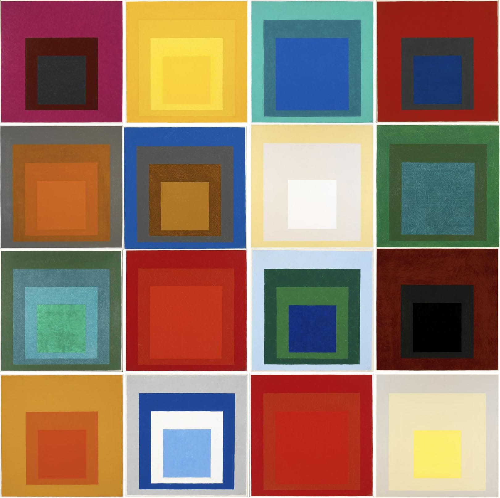
But what really stayed with me was his constant coming back to this series over the twenty seven years and how the subtle changes make each of the 1000 pieces totally unique. I found this extremely inspiring and seemed to answer the question I had been looking for, about the merits and benefits of artistic repetition, as well as how pieces within the series can still look fresh and new, even if the changes are minimal.
I knew I wanted to revisit my own series, I just needed an angle as to why to dive back in and what would make these new artworks unique from the previous two batches?


It was on a family trip to Kew Gardens Wakehurst that it finally struck me.
It was the middle of autumn last year and my wife, son and I were all enjoying the rich tones, spending most of the day picking up leaves from the array of beautiful trees around the gardens.
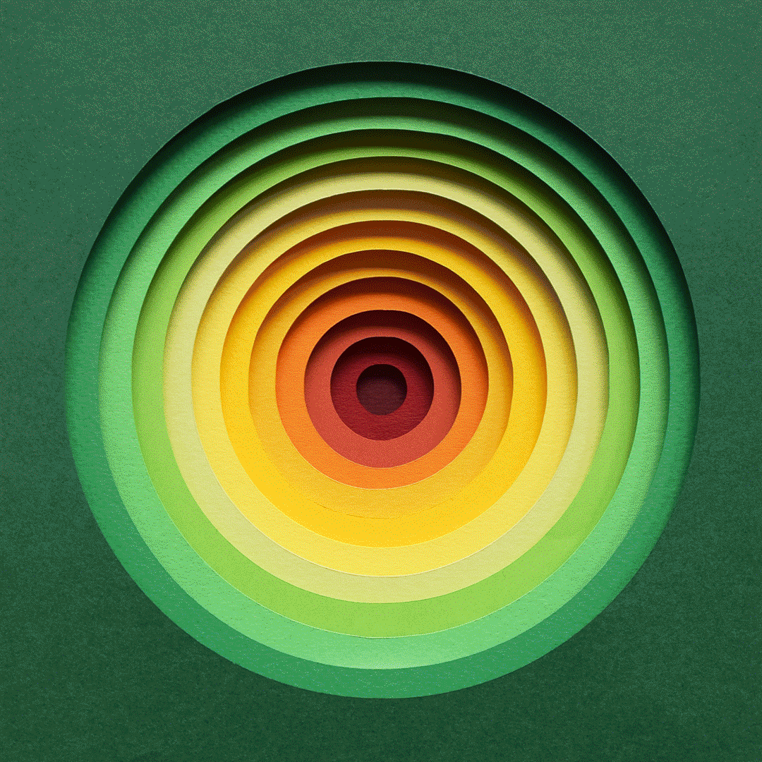
I started to notice the subtle colour gradients in the leaves I was picking up and it suddenly made me think, rather than the gradients being random based on the paper sheets I dug out of the draws, that it could be interesting to try to create a new series inspired by these autumnal colour tones.
So that’s just what I did! I spent the day photographing various leaves from around the gardens and then when I got back to my studio I delved deep into my draws to find paper sheets that resembled the autumnal tones I had found. It was an exciting departure, as the previous two batches of artworks had been very bright and vibrant, so this allowed for an exploration of softer more subtle earthy tones and gradients.
You can view the new series of artworks here and the remaining pieces will be on display at my upcoming Artists Open House in May, where I will be opening my studio to the public for the second ever time – more on that soon!
So where next? Well I’ll have to wait and see where the next source of inspiration takes me, but from the teachings of Girard and Albers I’m excited to have realised that the possibilities really are endless.
I hope you enjoyed this deep dive into my ‘The Sublime Spectrum’ series and it would be great to hear your thoughts? I plan to take a look into the importance of personal exploration next week, so watch this space! Thanks for following, Owen
I still remember the first time I saw your work in person. Until that point I didn’t think such intricacy in idea was possible. 🤝
I have one of your Sublime Spectrum pieces from a few years ago, so this is really cool to hear about your inspiration. Thanks for sharing!